Friday, August 13, 2010
Slideshow Final- that actually works!!
1- My first ultrasound ever, at 6 weeks. I used the Plaster filter on it, and I loved that tiny blob of Addison became her own little continent.
2- A later ultrasound, and I used the Plastic Wrap filter. It felt like it managed to bring alive all these little veins in a growing baby.
3- Cropped, desaturated, and framed belly picture with my husbands and my hands on her!
4- Desaturated, and text layer with a cute poem about motherhood put over it.
5- Cropped, and lots of clone stamp used to just try to make the picture a bit cleaner; removed some of the background, and I also used the heal tool on my face just a little bit. Addison was less than 10 minutes old!
6- Daddy meeting Addison for the first real time…. Cropped, desaturated, and the red enhanced.
7- Addison home for about 30 minutes for the first time, my dog meeting her for the first time, giving her kisses. This picture has a filter on it, called Accented Edges. It felt like it took a special moment for me, and immortalized it.
8- First time swimming at 2 months. I used the dodge tool here to fix the white in the top corner, the clone tool to clean up her little leg, and cropped the photo as well.
9- Addison smiling some of her first real smiles. I used the Glowing Edges filter on this, and it seemed to really bring her alive.
10- Cropped, made black and white, and then the eraser tool used to bring the color of her pj’s out.
11- First Christmas! Cropped, and a lot of the dodge and burn tools to bring out some of the colors.
12- Her shirt cleaned up, and lots of blurring and airbrushing to make this picture sort of silly.
13- Dodge and burn tools used, and the clone stamp used to make the whole curtain red, instead of seeing the inside of the curtain
14- Addisons first birthday! Layers, to give her a birthday background. Shes cut out of the original, and a light eraser used on the edges to feather, and a text layer as well. The layer with Addison in it was also made a bit opaque.
15- Addison running away from her pool this summer. Cropped. Clone stamp used to clean up the grass, and some contrast adjustments.
Monday, August 9, 2010
Portrait

My husband, out in the woods!!! Completely unedited, believe it or not! I love all of the greens in the picture- they really make all of the browns in his hair and eyes pop out.
Friday, July 30, 2010
Slideshow Final Project

1- My first ultrasound ever, at 6 weeks. I used the Plaster filter on it, and I loved that tiny blob of Addison became her own little continent.
2- A later ultrasound, and I used the Plastic Wrap filter. It felt like it managed to bring alive all these little veins in a growing baby.
3- Cropped, desaturated, and framed belly picture with my husbands and my hands on her!
4- Desaturated, and text layer with a cute poem about motherhood put over it.
5- Cropped, and lots of clone stamp used to just try to make the picture a bit cleaner; removed some of the background, and I also used the heal tool on my face just a little bit. Addison was less than 10 minutes old!
6- Daddy meeting Addison for the first real time…. Cropped, desaturated, and the red enhanced.
7- Addison home for about 30 minutes for the first time, my dog meeting her for the first time, giving her kisses. This picture has a filter on it, called Accented Edges. It felt like it took a special moment for me, and immortalized it.
8- First time swimming at 2 months. I used the dodge tool here to fix the white in the top corner, the clone tool to clean up her little leg, and cropped the photo as well.
9- Addison smiling some of her first real smiles. I used the Glowing Edges filter on this, and it seemed to really bring her alive.
10- Cropped, made black and white, and then the eraser tool used to bring the color of her pj’s out.
11- First Christmas! Cropped, and a lot of the dodge and burn tools to bring out some of the colors.
12- Her shirt cleaned up, and lots of blurring and airbrushing to make this picture sort of silly.
13- Dodge and burn tools used, and the clone stamp used to make the whole curtain red, instead of seeing the inside of the curtain
14- Addisons first birthday! Layers, to give her a birthday background. Shes cut out of the original, and a light eraser used on the edges to feather, and a text layer as well. The layer with Addison in it was also made a bit opaque.
15- Addison running away from her pool this summer. Cropped. Clone stamp used to clean up the grass, and some contrast adjustments.

Wednesday, July 28, 2010
clone tool
I may be over stepping my boundaries here, so if I am, Im sorry... and I cando something else. Ive just been playing with this tool for a while, so I wanted to push myself a bit, and had this image in my head..... so here it is! Clone stamp tool was used quite a bit, in making my hair match the hand, and my eyes looked different (nice, huh?) So I cloned one and put it over the other....


Saturday, July 24, 2010
Filter Work

Meet BTR, age 5, and SFF, 17mo. Already kissing :)
I took the picture and cropped it a bit, then chose Dark Strokes as a filter. I adjusted the balance and the black/white intensity a bit as well.

Dodge and Burn Work!
I took this picture from this week of my daughter, and thought it would be a good one to use for this assignment. I removed the (ahem) cracker from her cheek, cropped a bit of the right hand side of the picture out; then set to work. I used the burn tool initially with a big brush to go over everything but Addison and the wood of the door. Then I made it smaller and went around the edges with the burn tool to make it cohesive. Then I used the dodge tool to go over the wood, and Addisons skin. I feel like it just very easily makes her the center of the world, and everything else- even someones feet- disappear.
The edit:


The edit:

Sunday, July 18, 2010
Second Edit
This is what I started with:

I then adjusted the vibrance, the hue, and the saturation to make the sky even a bit more dramatic. Then I used the clone stamp to stamp bushes over the buildings on the left to take them out.


I then adjusted the vibrance, the hue, and the saturation to make the sky even a bit more dramatic. Then I used the clone stamp to stamp bushes over the buildings on the left to take them out.

First Edit...
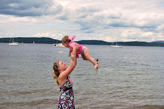
This was from today, at the beach.... this is the original photo:

And this is what I ended up with:
 I desaturated it, obviously. I also tried to make the contrast in the clouds a little more clear; and then I erased the desaturated parts of our clothes that I wanted to pop through. Of course, this is the popular trend known as 'colorsplash'.
 I desaturated it, obviously. I also tried to make the contrast in the clouds a little more clear; and then I erased the desaturated parts of our clothes that I wanted to pop through. Of course, this is the popular trend known as 'colorsplash'.
Sunday, July 11, 2010
Photo Edit
I had so much fun- I sent hubby and I on vacation to Costa Rica! Hey, why not, right? :D
I started with hubs and I REALLY on vacation, just a weekend in NH recently...

Yelled across the room "hey babe, if you could go on vacation anywhere RIGHT NOW, where would you go?"
"Costa Rica".
*Shrugs* "Ok, lets go to Costa Rica!"

And voila.... we're there :D

I started with hubs and I REALLY on vacation, just a weekend in NH recently...

Yelled across the room "hey babe, if you could go on vacation anywhere RIGHT NOW, where would you go?"
"Costa Rica".
*Shrugs* "Ok, lets go to Costa Rica!"

And voila.... we're there :D

Landscapes
Post your favorite landscape photos to your blog as well as a short description of what you learned about landscape, or what is was like "getting the perfect photo.


What I learned the most about getting the "perfect" shot was that I desperately need more lenses :D I had a hard time because I couldnt open up the edges of my picture as much as I wanted. These are all unedited; I recently got some filters this weekend, and now I can really see what the difference could have been if I had had filters on the lens before I took these.


What I learned the most about getting the "perfect" shot was that I desperately need more lenses :D I had a hard time because I couldnt open up the edges of my picture as much as I wanted. These are all unedited; I recently got some filters this weekend, and now I can really see what the difference could have been if I had had filters on the lens before I took these.
Sunday, June 27, 2010
Slideshow of frames
I had a hard time with these pictures because I started to get really wrapped up in exactly what constitutes as a frame, and what is just a pattern, or just one thing in the middle of two taller things, etc.... In my head it would be like "is that a frame?" "no, its more of a border", and those things seem really different. So this is what I ended up with!
Photo Comparison
Assignment #2 is to take a couple of really beautiful shots this week in two different ways. Take a shot centering the item of interest and then take a shot putting it on one of the "third" lines. Post the photos side by side and compare them on your blog.
I did this twice..... while I understood the assignement of course, and I did think that using thirds seems to be really powerful- but I had a hard time picking them, both to TAKE the picture, and which of the groups to post.
This is my daughter, at the play ground. The bottom is centered, and the top is on a third line.


This one is of one of my photo albums for my daughters pictures. The top is off centered, and the bottom is centered. It definitely changes the initial viceral response to the photo.


Wednesday, June 23, 2010
Composition
Photographic composition is the pleasing arrangement of subject matter elements within the picture area.
I want to share a page I found that was a really great, simple but detailed piece of information on composition.
One thing they talked about was viewpoint, and this is what was said about high viewpoint:
High Viewpoint and High Camera Angle
High viewpoints and high camera angles help orient the viewer, because they show relationships among all elements within the picture area and produce a psychological effect by minimizing the apparent strength or size of the subject.
This was interesting to me (as a psych student) because the current trend for MySpace and Facebook and other such sites is people to take high viewpoint pictures of themselves. From a photography student perspective, this seems like a good warning that shots from above can make the subject blend into its surroundings, and to avoid these shots if this isnt my desired effect; and to intentionally use the viewpoint if its important to make it easier for the audience to orient themselves.
Monday, June 21, 2010
Lighting Lessons!
So this was taken in the late afternoon; there was still a lot of natural light around me. No flash here.
 This was taken at night; it was almost completely dark, and the only source of light was the lfash.
 This was taken at about dinnertime, but it was raining out. Flash was on, but there was some natural light. That natural light was obviously interfered with by the rain.
 I think really, the lighting really showed me that when to use the flash is really important, and that sometimes, its more angle than what the current light is. Below are two pictures of my siding that I took while it was raining. It is literally the EXACT same shot, but the bottom has flash, the top does not. I really started to play with that in the last few days.... while I knew that natural light was technically "better", I always just let the flash be on automatic. However, since the assignment was lighting, I played a bit.... the flash totally washes everything out. Sure, the focus is a bit better, and the shadows are a bit more dramatic, but look at the color that is captured from the rain and sunset when the flash was off! It was exciting, and encourages me a lot to shut the flash off more often.

Saturday, June 19, 2010
Just two randoms I fell in love with.....
These were just two pictures I wanted to share; theyre obviously not an assignment, but thought it helped share a little bit about who I am!
This, is an edit of one of the pictures I used for "complimentary colors". I think this version is equally startling as the original, although its very different!

This is a picture my husband took of me and my daughter.... just wanted to share!

Monochrome, Complimentary,and Analogous Colors
I ended up doing an example of all three.... I thought it was a really interesting exercise. It certainly taught me the principles of the color wheel to walk around my house and go "all hues of the same color" "opposite each other... is red and blue opposite? No, red and GREEN...."
Below is monochrome. That means it is all hues of the same color; obviously, in this case, the color is green

Below are examples of a complimentary color scheme. This means the colors are directly opposite each other on the color wheel.


 The above picture displays an example of an analogous color scheme. This photo shows green, blue and purple next to each other, and the three colors are also next to each other on the color wheel.
 Thursday, June 10, 2010
Sams Collage
 I learned a lot from this assignment! About how important it is to pay attention to what you are catching in the corners of close ups; and how badly I want a lens for my camera thats better with macro!
Friday, June 4, 2010
Photo Comparison


I had a hard time, at first, trying to think of the best thing to use as a subject; then decided that maybe my husbands old hound dog/beagle would be a good subject! Her name is Penny..... these are the two pictures I chose to share (she eventually got sick of the flash and trying to ignore me, I think!).
I chose these two particular pictures, although they seem sort of similar, for a few reasons. One- the one on the right is the quietly silly, happy hound that I know and love. The picture encompasses the chair that is "her" chair- hence the blanket and throw pillows. Those are hers, and no one else is allowed to touch them! The one on the left, I was standing above her, looking down at her while she was starting to get anxious from the impromptu photosoot. The other side to Penny is her immobility from anxiety sometimes; shes a rescue dog, and after a while, many things start to make her uncomfortable. She literally almost freezes in place and zones out a bit. Here, shes certainly more relaxed than she sometimes is, but knowing her, I can see that she doesnt feel well. I know that when I have anxiety, I feel like everyone around me is zoomed in on me; so the closeup of this seems fitting.
I like the one on the right better, of course. I dont like knowing shes unhappy or uncomfortable. However, the twisted positions she puts herself in in that chair when shes happy is always a source of a quiet smile, and this picture does them same. Belly up, a little smile on her face and her lips falling open a little bit.
Subscribe to:
Comments (Atom)
